If you've ever worked with data, you know how much easier it is to spot trends when you can actually see them. That’s where line plots come in. Whether you're tracking stock prices, measuring temperature changes, or simply displaying how something grows over time, line plots are the go-to choice. And when it comes to making them, Matplotlib is like having a really solid set of art supplies—easy to use, reliable, and gets the job done right.
Why Line Plots Matter So Much
Let's be honest—looking at rows of numbers can get tiring fast. A line plot, though, tells a story with just a glance. You can see the rise and fall, the peaks and valleys, and everything in between. The beauty of Matplotlib is that it doesn’t require fancy coding skills to get started. A few lines of Python, and you're already looking at a clean, easy-to-read visual.
Plus, line plots aren’t just about making things pretty. They help you spot patterns that could be hiding in the data. Maybe sales dip every October. Maybe a heart rate monitor shows subtle changes you wouldn't catch by just scanning numbers. A line plot brings all of that to the surface, clear as day.
Step-by-Step Guide to Mastering Line Plots with Matplotlib
Getting Started with Matplotlib
First things first—you’ll need to install Matplotlib if you haven’t already. Just type pip install matplotlib into your terminal or command prompt, and you're ready.
Now for the fun part. Here's a basic setup to create your first-line plot:
python
CopyEdit
import matplotlib.pyplot as plt
x = [1, 2, 3, 4, 5]
y = [2, 3, 5, 7, 11]
plt.plot(x, y)
plt.title('Simple Line Plot')
plt.xlabel('X Axis')
plt.ylabel('Y Axis')
plt.show()
That’s it. Five lines of code and boom—you’ve got a plot. No long setup, no confusing settings. Just data meeting visuals in the simplest way possible.
Customizing Your Line Plots
Sure, a basic plot is nice. But sometimes you need more. Maybe you want to show multiple lines, change colors, or add a grid. Matplotlib makes all of this really easy, and it’s worth getting familiar with a few options so your plots look exactly how you want them to.
Multiple Lines on One Plot
Say you want to compare two different datasets on the same graph. Here's how you do it:
python
CopyEdit
x = [0, 1, 2, 3, 4]
y1 = [0, 1, 4, 9, 16]
y2 = [0, 1, 2, 3, 4]
plt.plot(x, y1, label='Squared')
plt.plot(x, y2, label='Linear')
plt.title('Comparing Functions')
plt.xlabel('X')
plt.ylabel('Y')
plt.legend()
plt.show()
Adding a legend is the trick to keeping things clear when you have more than one line. Notice how easy it is to label each dataset.
Changing Line Styles and Colors
If you want your graph to really pop or if you need different styles for clarity, Matplotlib has you covered:
python
CopyEdit
plt.plot(x, y1, color='red', linestyle='--', marker='o')
plt.plot(x, y2, color='blue', linestyle='-', marker='s')
You can tweak the color and line style (solid, dashed, dotted) and even add markers at each data point. It's like picking different brushes and colors for a painting—just a few tweaks and the whole feel of your graph changes.
Adding Grids for Better Readability
Sometimes, a grid can make a plot a lot easier to read, especially if you're trying to match a point to an exact value. Here's how to add one:
python
CopyEdit
plt.grid(True)
Simple, right? And it makes a big difference when precision matters.
Advanced Features You’ll Want to Try
Once you’re comfortable with the basics, you might want to step things up a little. Matplotlib has a few extra features that can really sharpen your plots and make them even more useful.
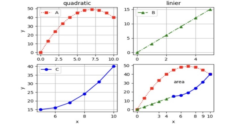
Subplots for Multiple Graphs at Once
Sometimes, one graph isn't enough. Maybe you want to show different trends side-by-side. Subplots make this possible:
python
CopyEdit
fig, axs = plt.subplots(2)
x = [0, 1, 2, 3, 4]
y1 = [0, 1, 4, 9, 16]
y2 = [0, 1, 2, 3, 4]
axs[0].plot(x, y1)
axs[1].plot(x, y2)
axs[0].set_title('Squared')
axs[1].set_title('Linear')
plt.tight_layout()
plt.show()
Now, you have two graphs stacked neatly in the same window. Each can have its title, label, and style.
Filling Between Lines
Another neat trick is filling the area between two lines. This is handy for showing ranges or highlighting the difference between two datasets:
python
CopyEdit
plt.plot(x, y1)
plt.plot(x, y2)
plt.fill_between(x, y1, y2, color='lightgray')
plt.show()
With just one command, you add a shaded area that visually explains the difference between the two lines.
Adding Annotations
Sometimes, you want to point something out directly in the plot. Annotations do exactly that:
python
CopyEdit
plt.plot(x, y1)
plt.annotate('Peak Point', xy=(4, 16), xytext=(2, 15),
arrowprops=dict(facecolor='black', shrink=0.05))
plt.show()
This puts a label with an arrow right at the spot you want to highlight. No confusion about where to look.
Finishing Touches Make a Big Difference

When you put a little extra thought into your plots, it really shows. Always add titles, labels, and legends if your plot needs them. Make sure your axes make sense—sometimes, changing the scale or the range of the axes can make a plot easier to read.
Matplotlib also gives you options to save your plots easily. Whether you want a PNG, a PDF, or even a high-res SVG, saving your work is just one line:
python
CopyEdit
plt.savefig('my_plot.png')
And you’re set.
Wrapping It Up
Line plots are one of the easiest and most powerful tools for showing trends and relationships. With Matplotlib, creating and customizing them is a smooth and quick process. Whether you're keeping it simple or adding some polished extras, you’ll have everything you need right at your fingertips. Get your data ready, write a few lines of Python, and enjoy how much easier it gets to see the bigger picture.